What Color Would You Paint Against This?

"I'm a decisive person."

I say this all the time. And it typically holds true. But I have found myself stuck in a space where I can't seem  to think clearly about a decision I have to make.

My issue?

I have no idea what color to paint walls to go with this carpet...


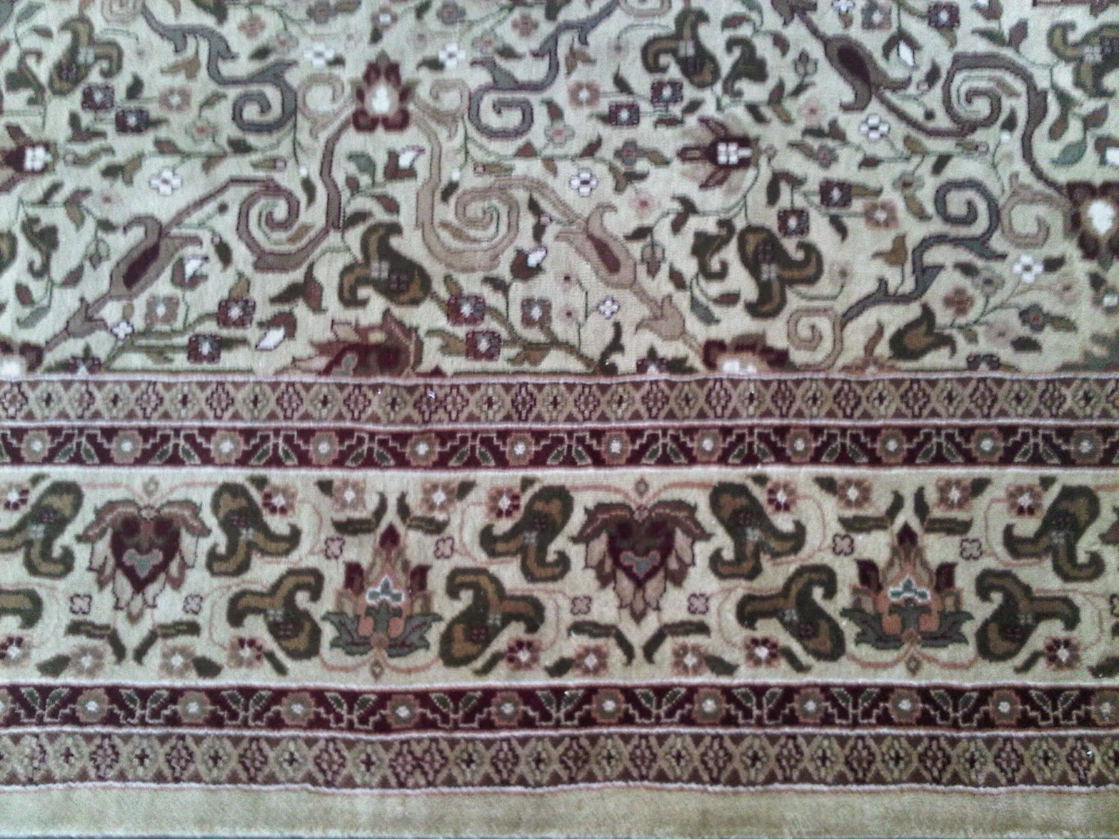
Big thanks to Newman, my ex, for sending e a picture of the carpet. When we split, we each took one of the paired large carpets from our formal living room. They were initially designed to go in a room with golden yellow walls and cream-colored furniture. But seeing as most of our house in Toronto had yellow walls, I have no desire to paint walls that color ever again.

So now, I have no idea what color to paint the walls of the guest room, which is where this carpet will live.

This is the room it will be going in at the new place...


As you can see, it gets great light. Imagine the carpet gone, and in place light hard wood. The crown molding and base molding will stay white. That ceiling fan will be gone. (It has spaceships on it - anyone want it?)

I am only using Benjamin Moore paints for this remodel. And looking at the Color Gallery, I am overwhelmed and lost.

Thoughts? I am open to suggestions!

Comments

mad-scientist said…
Rich rustic brown
Simmm said…
I would do a midnight blue or dark blue-ish grey, because I see some medium blue-ish grey swirls in there. Otherwise a deep burgundy, because I see that in there too. I had a deep burgundy/oxblood red in my bedroom a few years back and it was SO cozy esp with gold accents.
Anonymous said…
If you want the rug to POP, I would paint the walls white. There are hundreds of different shades of white to choose from these days. Or just a light white/grey color.
Me said…
I am actually leaning towards grey. My mum recommended Dolphin grey... Which I think will work really well. A lot of people recommended I paint the room burgundy... Which would go well with the carpet... But I feel like asking a guest to sleep in a burgundy room is mean.
Unknown said…
No offense to anyone who recommended burgundy, but the jewel tones of the 90s - forest green, burgundy, navy blue - are out. Earth tones are in, and a grey or slate blue would be great with the carpet. More important than the color, though, is the finish. Eggshell is always a NO - it doesn't reflect light and looks ashy. Satin is always my choice, except for bathrooms, which need a high gloss to give you the best lighting. If you are adventurous, try 6-inch alternating stripes of satin and semi or high-gloss in the same color. I did that in the dining room of my old house - the effect was striking. Also, if you have crown, you may want to consider doing the ceiling in a lighter shade of the wall color, also in a satin. It makes the room appear larger and airier. Just some ideas - decorating is a serious hobby of mine:)
Me said…
Agree! Jewel tones are very 1990s. Very early 1990s! I did have the stripes of of gloss paint (spaced 6-inches apart) in the living room of our Toronto place. It had a cool effect. The idea of painting the ceiling in a satined lighter color is a really good idea! Thinking grey is the way to go too. THANKS!

Popular Posts